All presets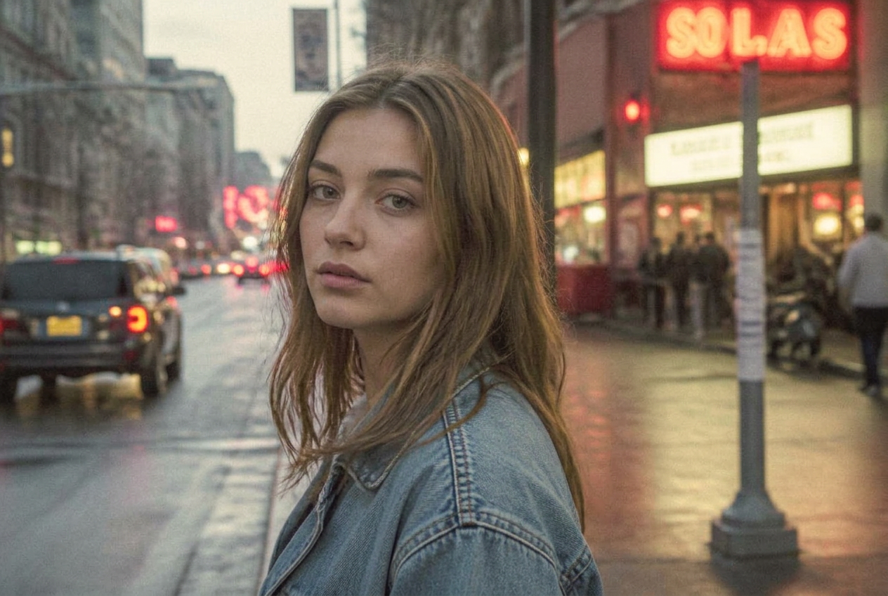
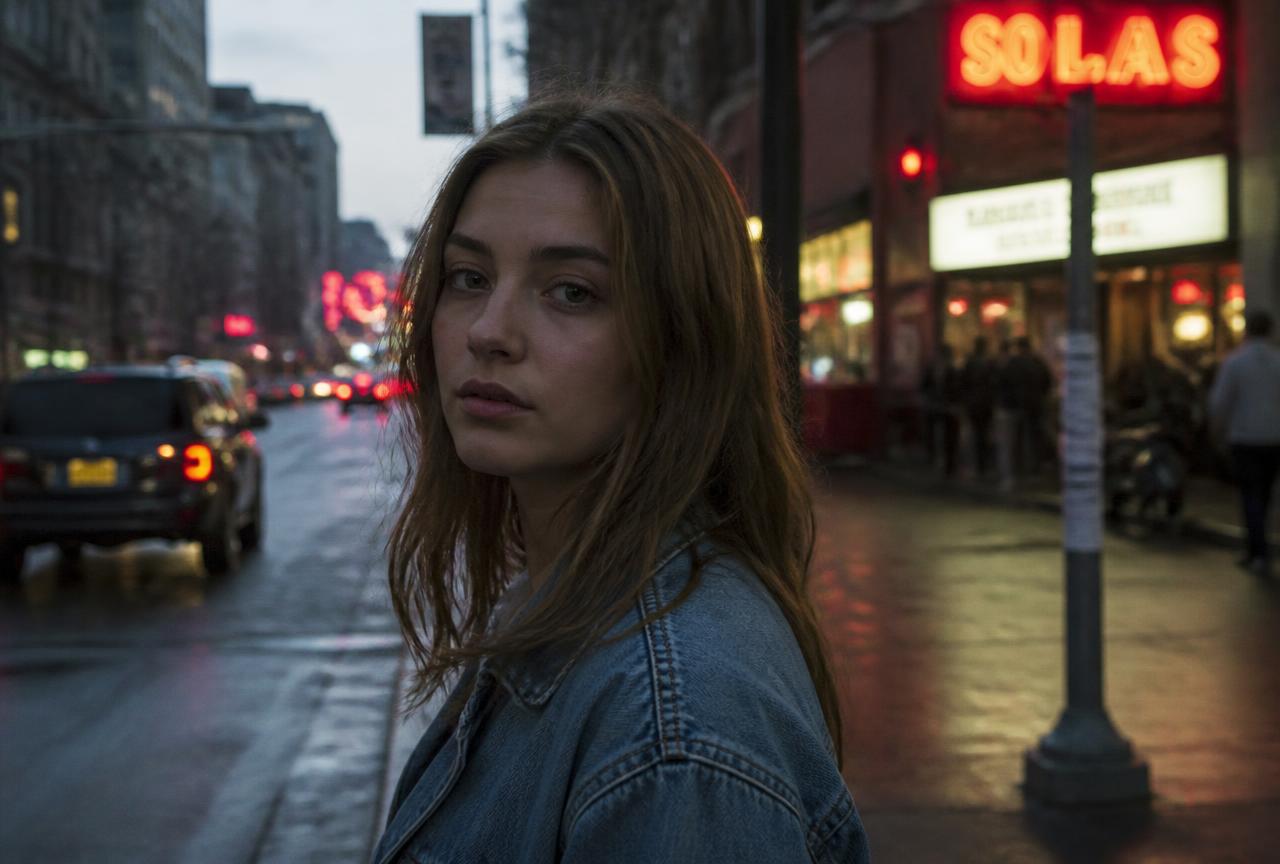
Vintage faded
Washed analogue photo
Matte blacks, pastel colour and a warm cast — a photo that looks like it was printed twenty years ago and left in the sun.
BeforeAfter
↔
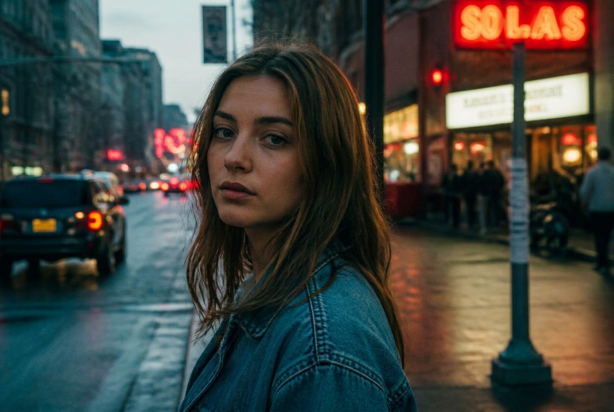
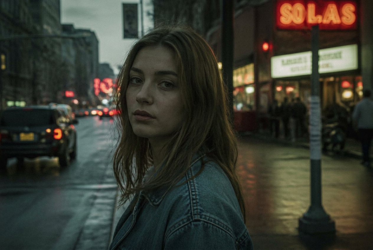
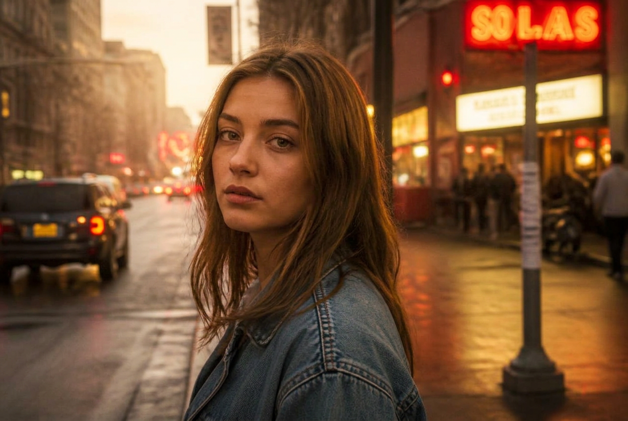
Demo imageDemo images are generated illustrations, not photographs taken with a specific camera. They show the direction of the look, not a guaranteed result.
The settings
White balance
- Temperature
- 5900 K
- Tint
- +10
Light
- Exposure
- +0.10
- Contrast
- -20
- Highlights
- -15
- Shadows
- +20
- Whites
- -15
- Blacks
- +30
Presence
- Texture
- -5
- Clarity
- -10
- Dehaze
- -12
Colour
- Vibrance
- -5
- Saturation
- -20
Colour grading
- Highlight tone (hue)
- +50
- Highlight tone (amount)
- +20
- Shadow tone (hue)
- +320
- Shadow tone (amount)
- +14
Grain
- Grain
- +30
- Grain size
- +28
Why these numbers
- A high Blacks value with low Contrast is what 'faded' actually means.
- Low Saturation plus a warm highlight tone gives the aged paper feeling.
- More grain than usual — old photos are never clean.
Adjust it for your photo
- Too flat? Add +10 Contrast; the fade survives.
- Reduce the yellow cast with Temperature down to about 5000 if skin looks ill.
Best for
Film-style portraitsSummer snapshotsNostalgic setsInstagram grids
A preset is a starting point, not a finished edit. Always check exposure and white balance afterwards — the same values look different on a different photo.